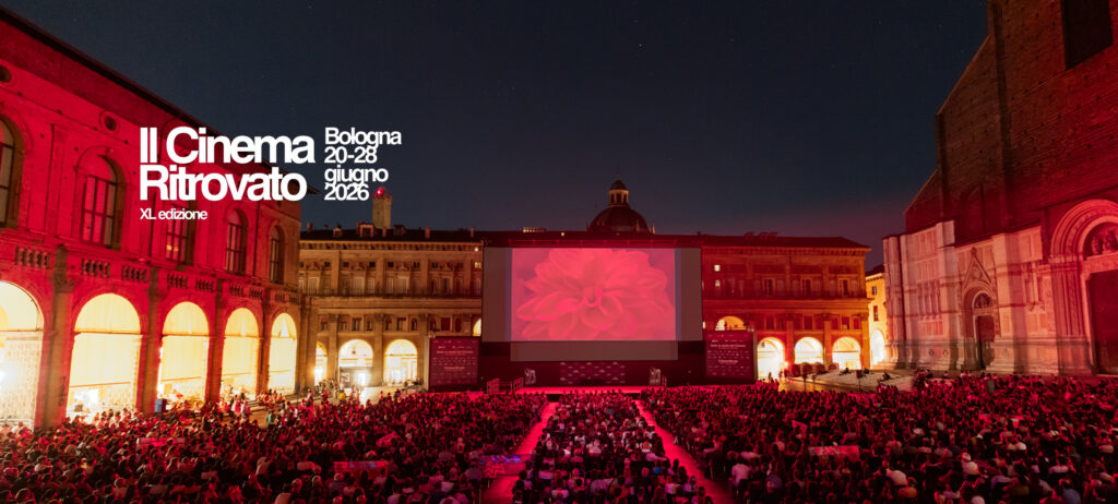
The Cinephiles’ Heaven
[2019]
Each year our experience with the colours of cinema throughout film history is broadened by new restorations and a new sensitivity, in constant expansion with new achievements. This year we are presenting new restorations of hand-coloured films from the archives of Amsterdam, Berlin, Bologna, Prague, Stockholm; holding a conference with Stéphanie Salmon from Fondation Jérôme Seydoux-Pathé who will show us inside Mme Tuiller’s atelier and the work of early 20th century pochoir whizzes; and showing the most beautiful colour process of all time, Chronochrome Gaumont, which in the 1910s could only be seen at two cinemas in Paris and today, thanks to digital technology, can be shown on screens around the world.
At this extraordinary edition of the festival, thanks to the work of the great historian and technician François Ede, we will see the first example of the Keller-Dorian-Berthon process in the delightful 1926 film about the Sonia and Robert Delaunay’s work on textiles and colours, and the colour version of Max Fleischer’s animated short Vacation, found at last by the Národní filmový archiv.
The main attraction this year is once again Technicolor. First up is the earliest feature film with actors to use the three-strip process, Becky Sharp, magnificently restored by our friends at Paramount. The three colours of the new process were so beautiful they transcended reality. Not only had cinema reached the coveted achievement of colour reproduction, but the process also made such brilliant and explosive colours that it perhaps was the most dazzling technology that audiences had ever experienced.
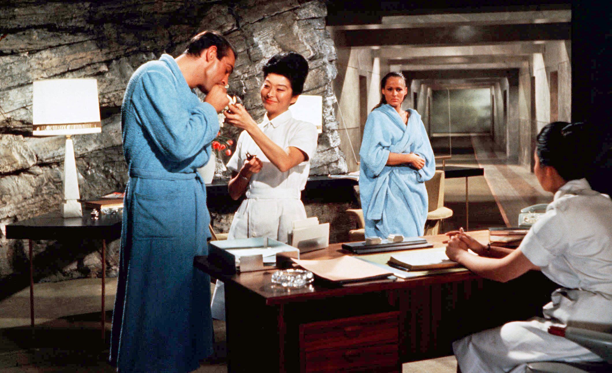
Thanks to the efforts of the Academy’s archive and the BFI, we will see six vintage Technicolor prints from very different periods on the screen of the Arlecchino cinema, including Under Capricorn, one of the most misunderstood Hitchcock films (according to Jacques Lourcelles also one of the finest Technicolor pictures of film history); Gigi, which won nine Oscars, including for Joseph Ruttenberg’s cinematography; Dr. No, in which colour is the scenery; and The Wild Bunch, whose deep blacks are as important as the blues of the sky looming over Way of a Gaucho, an ‘Argentine’ western by Jacques Tourneur.
Two digital restorations round off this section. First Moulin Rouge, a groundbreaking film for its use of colour by John Huston and Oswald Morris, a fearless duo of experimenters. Then Clemente Fracassi’s Aida, with Sophia Loren dubbed by Renata Tebaldi, shot in Ferraniacolor but printed in Technicolor. The colours live up to the greatest pulp-fiction moments of this one-off and surprising work.
Gian Luca Farinelli
Edition History
‘Educating the eye’ was the name Alfred Lichtwark (1852-1914), a German art historian and pioneer of museum pedagogy, gave his project for turning students into connoisseurs and art-lovers by the process of looking at art works. For thirty years now coloured silent films have normally been duplicated in colour and shown to audiences – so why a special festival section on this long-familiar aspect?
It is to turn us into connoisseurs of rich colour universe of pre- 1920 film, and of its three main colour systems – black and white, monochrome tinting or toning, and polychrome pochoir colouring – and to school our eyes by watching films coloured by different techniques and reproduced by different methods.
Three restorations using original techniques – Cikáni, The Johnstown Flood (both Národní filmový archiv / Jan Ledecký) and The Chalice of Sorrow (UCLA / Stanford Theatre Film Laboratory) – offer an essential viewing experience. Just like the nitrate originals, these are black-and white positives, developed on black-and-white stock and then tinted and/or toned. It is only with this method that the entire emulsion layer is used for the developing the photographic image. With Desmet restaurations or play-outs of digital scans on to colour stock, on the other hand, both the photographic image and the colours are developed from the emulsion, with negative consequences: the photographic image is weaker, and a true black, white or grey cannot be achieved with colour stock. The change of medium from analog to digital brings new possibilities, but at the cost of new losses in fidelity. Thus every restoration is an interpretation of the original (just as the performance of a musical score is an interpretation), and as connoisseurs and film-lovers we can discern with an educated eye its strengths and weaknesses.
(Mariann Lewinsky)
Programme Silent Colours curated by Mariann Lewinsky
Programme The Colours of Sound Films curated by Gian Luca Farinelli
SILENT COLOUR
Programme curated by Mariann Lewinsky
Magic lantern slides are in bright colour. The arts of the 19th century were intoxicated with colour. We see it in orientalism, historicism, Second Empire and Belle Époque evening fashions, as well as the work of painters in light from Turner to the Impressionists. Open-air events such as parades were large-scale colour spectacles – for, hard as it is to imagine today, the whole of the military was, visually, an extremely frivolous affair, with uniforms in all colours of the rainbow, with fantastical head-gear, helmet plumes and panaches, with silver and gold braid, stripes and buttons. At the earliest programmes of the Cinématographe Lumière, the lack of colour attracted immediate attention: “These images [of parades during the Tsar’s visit] left me cold. They were dull and insipid, for the colours – which play a crucial part in such events – were missing and what remained were pale shadows.” (Stadtchronik section, Zürcher Post, no. 92, 3.11.1896). Pallor, colourlessness: these mean winter and death. Colour and bright tones stand for summer and life. The film industry addressed the problem by, first of all, taking over the hand-colouring technique originally developed for photography and, later, adapting and perfecting other colouring processes.
Though we may give the impression that nitrate prints are on their death bed, many are in fact (for the time being) fresh as a daisy – and delightfully coloured. But they cannot be projected. We have to produce a substitute, so as to reveal in projection something of the life and colour of the originals. That “something” means as much as possible. The pursuit of “as much as possible” is one of the challenges of film restoration.
(Mariann Lewinsky)
SEARCHING FOR COLOUR IN SOUND FILMS
Programme curated by Gian Luca Farinelli e Peter von Bagh
DOSSIER AGFACOLOR
Agfacolor was the first negative/positive process with chromogenically developed multilayer cine films, introduced in 1939. During the World War II Agfacolor had been used for 13 color features. After 1945 the Agfacolor system chemically became an example to other color films including Ferraniacolor. The lecture by Gert Koshofer covers the technical history of Agfacolor. Its first use for a feature film was for the UFA movie Frauen sind doch bessere Diplomaten. As forerunners of Agfacolor served here two-color systems like Ufacolor, the three-color printing process of Gasparcolor and the complicated Agfa Pantachrom system. Agfacolor conquered them all by its relatively simple method. This was a real sensation compared with Technicolor.
The development and introduction of Agfacolor had been promoted by the German government, especially by nazi propagandaminister Dr. Joseph Goebbels who was convinced that German color films soon could compete with Hollywood productions.
Except for Veit Harlans Kolberg, the majority of German color films before 1945 consisted of musical-comedies (like Die Fledermaus), fairy-tales (like Münchhausen) or melodramas (like Opfergang). They gained tremendous box office success not only in Germany but all over Europe – including neutral countries.
Regarding the specific wartime situation, Friedemann Beyer introduces the most important Agfacolor feature-films between 1939 and 1945, their directors, stars and tendencies and places them as part of an economic battle to gain predominancy over European screens.
(Gert Koshofer and Friedemann Beyer)
IN THE MOOD FOR COLOUR
These devastating years we are living through have at least brought one merit: they are restoring to us the brightness and great variety of the colour of one hundred years of cinema.
Cinema colour, the fantasy of those experimenters who, right at the dawn, imagined coloured films. Since this was still not possible to record, they invented the paintbrush, tinting, toning, and then the pochoir technique.
Colour was supposed to be useful in taking cinema closer to reality, but it is evident that the opposite occurred – it distanced it. A wonderful departure point for unfaithfulness, only time in a film is even falser than its colours!
Perhaps it is precisely this common principal of falsifying that acts as the foundations to the creation of an unwritten code of rules, generating a screen-viewer relationship that exists on a more intimate and more ‘secret’ level. In this relationship, screen size also plays an important role. The pumps of Red Shoes have a different impact depending on whether they are seen on a large screen or on television. Intimacy is also conveyed through dimension.
Colours – so fleeting and deceptive, far from reality, different from copy to copy, and from screening to screening. Yet they are an extraordinary compass for indicating what time we are in, when the film we are watching was shot. The colours of the 1910s, or the ’40s, ’70s or ’90s, immediately betray their era, more than the sets, performers or style formulas.
And what common denominator do such diverse works as Senso, Il Gattopardo, Jubal, Picnic, Johnny Guitar, African Queen share? That they were made within a very brief time bracket, between 1954 and 1963, during the golden age of cinema and colour experimentation. Apart from the silent years, the Technicolor era is the one that, in the collective memory, best identifies with a chromatic season. The yellow of Singing in the Rain is certainly one of the key colours of the ’50s, because film colours correspond, in our collective memory, to those of the society of those years. The films we present this year, in the sound section, all share other affinities: their makers use colour in a very demanding way, assisted by photography directors and costume designers with prime visibility. John Huston, Luchino Visconti, Delmer Daves and Nick Ray were all born within a seven-year period, between 1904 and 1911. Hence their tastes were shaped through a 19th century view of the world, with colours that were substantially different to the ones we are familiar with today – colours influenced by the relationship with painting. And what is Technicolor if not the most 19th century system of a 19th century art? In technological terms, it is rather similar to Pochoir, which uses the same type of colour – aniline dyes – to print the chromatism on black and white copies.
The wild Trucolor of Johnny Guitar, the wonderful European Technicolor of Senso, the extremely elaborate Eastman of Il Gattopardo, and the tints of the American Technicolor of Picnic… Are these not the souls to the films, stirring the deepest subconscious reactions that have us remember them because they touch the most intimate areas in our sensory perception? At the end of 2008 Martin Scorsese entrusted us with the demanding task of restoring Senso – a project concluded recently, with the printing of the copy to be screened at this year’s festival. For eighteen months, Scorsese retrieved a certain number of memories, which for him were fundamental and indelible, such as the red of the flowers strewn on the stalls from the stage, at the start of the film, and the gold and the whiteness of the Habsburg jackets. Very clear memories, corresponding with the period material that came to us and guided our restoration.
What do we remember of a film? The plot, of course, the actors and actresses, some lines, a situation, a style… But in the memory game that has us attached to certain freeze-frames for decades, what part do colours play? Is not the chromatic mood of a film perhaps the most secret and intimate aspect of our relationship with the films we have loved?
The incredible colours of the actors’ shirts in Johnny Guitar, Katharine Hepburn’s white dress, which loses its brilliance, during African Queen, the soldiers’ military uniforms in 317eme , which Indochina’s mugginess immediately turns grey (because even a black and white film can have its connection with colour), the pure white caps in Cuffie della Frisia, from 1910, the gilded rooms of the final party in Il Gattopardo, William Holden’s tan in Picnic, the skies and the countryside in Jubal… but we could also go on, with the retrospective on Stanley Donen, that master of colour, with the sky and the dazzle of the skyscrapers in his New York. Are these not the materialization of our deepest memories of all these films?
Gian Luca Farinelli
Programme Colour in Silent Cinema curated by Mariann Lewinsky
Programme Searching for Colour in Films curated by Gian Luca Farinelli and Peter von Bagh
Searching for the color of film, as this section’s title suggests, is an attempt at the impossible. It is impossible to repeat or hold on to a film’s color. It is a fact that film printing labs know well, each print of the same work being different from the next. It is a fact that projectionists know well, each screening betraying the one before it and the one after, with too many variables, theaters, projectors, lamps, bulbs, lenses and, now, digital equipment. Today we know that our memory is the only thing left, and it changes: it never gives us back a perfect copy of what we experienced, just an updated one. I am convinced that, of all the elements of a film, color is what we perceive more physically, what creates deeper, physical and unconscious emotions that feel indelible to us.
The colors of silent film, the baffling realistic illusions of pochoir, the two color printing of Kinemacolor, Ava Gardner’s lips, the silk fabrics worn by Valli, the scorched faces in Leone’s films, Anna Karina’s T- shirts, are these not a kind of primary information, a chromatic com- pass that stays with us for the rest of our lives?
We are surrounded by a state of confusion while the media world feeble-mindedly forces large visual formats into a cell phone’s display. But our memory of the colors we have seen enables us to pin-point the decade in which a film or photo was made; it allows us to perceive the extent of deception, when too many colors do not correspond with our primary compass. Even if this is an era of deceit, today, for the first time, in just a few days we can see perfect prints not only of films from the silent era but also impossible dreams, films that we never believed we would see in their entirety, in the brilliance of their own chromatic system. The Red Shoes, Senso, Pierrot le fou, these films alone are like a festival of dreams come true.
Even still, despite being intoxicated by the colors of this weeklong event, in some hidden corner of our mind, in a dark fold of our gut, something will tell us that the colors we saw were different; they were purer, closer to their creators’ vision. With this in mind we will be ready to face the second part of our search next year.
(Gian Luca Farinelli)
Programme curated by Gian Luca Farinelli and Peter von Bagh